

Introduction
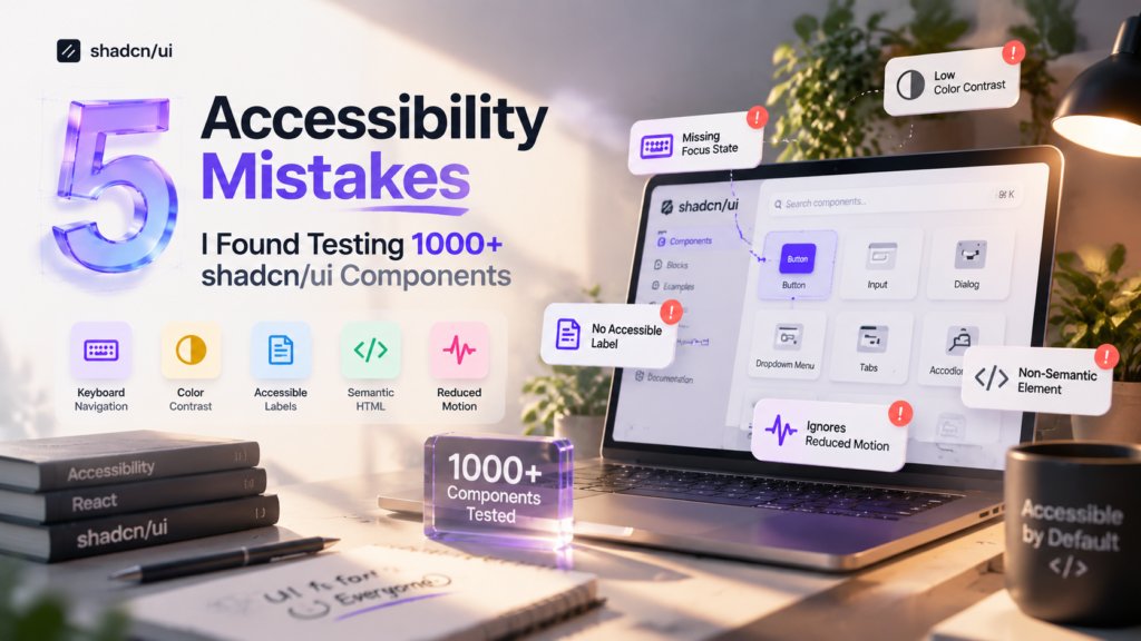
After testing and reviewing more than 1000+ shadcn/ui components across different React applications, I noticed something interesting:
Most accessibility problems were not caused by shadcn/ui itself. The majority of issues appeared after developers started customizing components.
A developer would take an accessible component, adjust the styling, replace a semantic element, remove a focus style, change colors, add animations, or simplify the markup and somewhere during that process, accessibility would slowly disappear.
This is one of the biggest misconceptions about modern component libraries:
“If the component library is accessible, my application will automatically be accessible.”
Unfortunately, accessibility doesn’t work that way. Libraries like shadcn/ui provide a strong foundation, but the final accessibility quality depends on every decision made during implementation.
What is shadcn/ui?
shadcn/ui is a modern React component collection built around reusable, customizable components. Unlike traditional UI libraries where components are installed as dependencies, shadcn/ui provides the component source code directly into your project.
This approach gives developers complete control over:
- Component structure
- Styling
- Variants
- Behavior
- Design system integration
Built on accessible foundations
Many shadcn/ui components (Dialog, Dropdown Menu, Select, Tabs, Accordion, Popover and others) are built on top of Radix UI primitives. Radix handles the difficult accessibility work for you, including focus trapping in dialogs, arrow-key navigation in menus, correct ARIA roles and states, Escape-to-close behavior, and returning focus to the trigger when something closes.
Out of the box, you’re starting from a strong position. The components are commonly built using accessible primitives from Radix UI.
Radix provides accessibility features such as:
- Keyboard navigation
- Focus management
- ARIA attributes
- Screen reader support
- Proper interaction patterns
For example, a shadcn/ui Dialog is not just a styled modal.
Underneath, it uses accessibility patterns like:
- Focus trapping
- Escape key handling
- Screen reader announcements
- Correct dialog roles
The foundation is already there.
The problem begins when developers customize the component without understanding which parts are responsible for accessibility.
So why do accessibility issues appear?
Because you own the code, you can also break it. There’s no library maintainer standing between your design decisions and your users. When a component is customized, the accessible defaults are only one className edit away from disappearing.
Accessibility Is More Than Screen Readers
When many developers hear “accessibility,” they immediately think about screen readers. Screen readers are important, but accessibility covers much more.
A complete accessibility experience includes:
Keyboard Navigation
Can users operate your interface without a mouse?
Examples:
- Opening menus with Enter
- Closing dialogs with Escape
- Moving through tabs using arrow keys
Focus Management
Can users understand where they currently are?
A keyboard user depends on visible focus indicators. Without focus states, navigation becomes a guessing game.
Color Contrast
Can users clearly read and understand information?
Poor contrast affects:
- Users with low vision
- Older users
- Users in bright environments
- Users with temporary vision problems
Semantic HTML
Does the browser understand what your element actually does?
A button should be a button. A navigation area should be navigation. A form field should have a label.
Screen Reader Support
Can assistive technology understand:
- What an element is?
- What action it performs?
- What state it has?
Motion Preferences
Do animations respect users who experience motion sensitivity?
Modern interfaces use:
- Framer Motion
- Scroll animations
- Hover effects
- Page transitions
But animation should always be controlled.
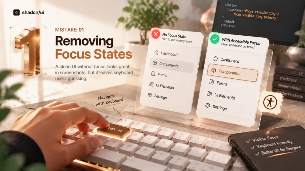
Mistake 1: Removing Focus States During Customization
This was the single most common issue I found.
A designer sees the focus ring during a review, decides it looks “off-brand,” and the developer removes it. The UI looks cleaner in screenshots. Keyboard users lose their only way of knowing where they are on the page.
Common mistakes
- Removing outlines globally with { outline: none; }
- Adding focus:ring-0 or focus-visible:ring-0 to kill shadcn’s default ring
- Using outline-none without providing any replacement indicator
- Overriding the -ring color token so it matches the background
The Common Mistake
A typical customization looks like this:
<Button className=”focus:ring-0″>
Submit
</Button>
or:
<Input className=”outline-none” />
or:
<button className=”focus:outline-none”>
Save
</button>
This looks harmless, but it wipes out the visible focus indicator. A keyboard user tabbing through a form now reaches the Submit button and sees… nothing. They have to guess whether focus is on the button, stuck somewhere else, or lost entirely.
The same thing happens in reverse with an outline-none that has no replacement:
// ❌ Removes the browser default and adds nothing back<input className=”outline-none border rounded-md px-3 py-2″ />
Why Focus States Matter
For a mouse user, the cursor shows where they are. For a keyboard user, the focus indicator is the cursor. This includes people with motor disabilities, power users, people using switch devices, and anyone whose trackpad just died.
WCAG (Web Content Accessibility Guidelines) 2.4.7 (Focus Visible) requires that keyboard focus is visible. Without it, navigation becomes a guessing game: users press Tab, lose track of their position, press Tab five more times, and eventually give up.
Imagine navigating a dashboard only using the Tab key.
You press:
Tab
Tab
Tab
Tab
The browser moves between:
- Search input
- Navigation links
- Buttons
- Dropdowns
- Forms
The focus indicator tells you:
“This is the element you are currently controlling.”
Better Solution: Use Focus-Visible
The goal is not to keep ugly browser outlines. The goal is to create a better focus experience.
Instead of removing focus:
<Button className=”focus:ring-0″>
Submit
</Button>
Use:
<Button className=”
focus-visible:ring-2
focus-visible:ring-primary
focus-visible:ring-offset-2
“>
Submit
</Button>
Now:
- Mouse users do not see unnecessary focus styles.
- Keyboard users get a clear indicator.
Creating Branded Focus States
Accessibility does not mean your UI has to look generic. You can create custom focus styles.
Example:
<Button
className=”
focus-visible:outline-none
focus-visible:ring-2
focus-visible:ring-blue-500
focus-visible:ring-offset-4
“
>
Continue
</Button>
This keeps:
- Brand colors
- Modern design
- Accessibility support
Who Is Affected?
Removing focus states affects:
- Keyboard-only users →Some users cannot use a mouse and depend completely on keyboard navigation.
- Users with motor disabilities → Keyboard navigation can be easier than precise mouse movements.
- Power users → Many developers, designers, and advanced users navigate applications quickly using shortcuts.
Components Commonly Affected
For reusable component patterns, Shadcn Blocks can provide consistent structures that are easier to review and test for accessibility.
During audits, these components frequently had focus problems:
Button
Common issue:
focus:ring-0
Input
Problem:
Users cannot identify the active field.
Tabs
Keyboard users need to know:
- Which tab is active
- Which tab currently has focus
Dropdown Menu
Focus indication is essential when moving through menu items.
Dialog
When opening dialogs, users need clear focus movement.
How To Test Focus Accessibility
Do not test only with a mouse.
Use this simple process:
Step 1
Remove your hand from the mouse.
Step 2
Press: Tab
Repeatedly.
Step 3
Check every interactive element:
- Can I see where focus is?
- Is the focus style clear?
- Does focus move logically?
A good rule:
If a user cannot understand where they are using only a keyboard, the component is not finished.
Mistake 2: Breaking Color Contrast After Theme Customization
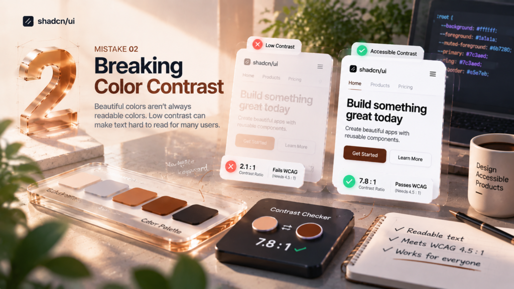
The second major issue I found was contrast problems after developers customized shadcn/ui themes. The default shadcn/ui color system is designed around accessible tokens. Problems usually appear when teams start replacing those values with custom colors.
The Problem With Beautiful Colors
A color palette can look amazing in Figma but fail in real usage.
For example:
A designer chooses:-
Background: #FFFFFF
Text: #B8B8B8
The interface feels soft and minimal. But the text becomes difficult to read.
Common Contrast Mistakes
- Weak Muted Colors
- Poor Dark Mode Contrast
- Light Gray Text on White Background.
- Invisible Borders like Input fields, Cards, Tables, Navigation.
- Dark mode themes where only the backgrounds were changed, leaving text tokens nearly invisible
Beautiful colors aren’t always readable colors
A color palette can look stunning in Figma on a calibrated monitor and fall apart on a cheap laptop screen, a phone in sunlight, or for a user with low vision.
WCAG(Web Content Accessibility Guidelines) contrast requirements (Level AA):
| Content | Minimum contrast |
| Normal text | 4.5:1 |
| Large text (≈24px regular, or ≈18.5px bold) | 3:1 |
| UI components and meaningful graphics (borders of inputs, icons, focus rings) | 3:1 |
Understanding Contrast Requirements
WCAG defines minimum contrast requirements between foreground and background colors.
For normal text:
4.5:1 minimum contrast ratio
For large text:
3:1 minimum contrast ratio
The goal is not making every interface high contrast. The goal is making information readable.
Who Gets Affected?
Poor contrast impacts far more people than most teams expect: users with low vision, older users (contrast sensitivity naturally declines with age), people with color vision deficiencies, anyone using a screen outdoors or in bright light, and users on low-quality or dimmed displays.
How to fix it: build accessible color tokens
Because shadcn/ui is token-driven, you can fix contrast once at the theme level instead of patching every component. Test each pair of tokens that actually appear together:
| Text / element token | Against | Target |
| `–foreground` | `–background` | 4.5:1+ |
| `–muted-foreground` | `–background` and `–muted` | 4.5:1+ |
| `–primary-foreground` | `–primary` | 4.5:1+ |
| `–destructive` text or icons | `–background` | 4.5:1+ (text), 3:1 (icons) |
| `–border` / `–input` | `–background` | 3:1 for input borders |
| `–ring` | `–background` | 3:1+ |
Do this separately for light and dark mode. Dark mode was where I found the highest density of contrast failures, because teams often inverted backgrounds but reused mid-tone text colors.
A note on disabled states: WCAG technically exempts disabled controls from contrast rules, but users still need to understand that a control exists and why it’s unavailable. Aim for something readable, and don’t rely on opacity alone. opacity-50 on an already low-contrast color often produces something that’s effectively invisible.
Better Approach: Use Design Tokens
Instead of choosing colors randomly:
Bad:
text-gray-400
Create intentional tokens:
–foreground
–background
–muted
–border
–primary
Then test each relationship.
Check These shadcn/ui Colors
During theme customization, always test:
- Text: foreground, muted-foreground
- Backgrounds: background, card, popover
- Actions: primary, secondary, destructive
Components Affected
Contrast issues commonly appear in:
- Cards: Card title, Metadata, Description text
- Buttons: Secondary buttons, Ghost buttons, Disabled states
- Forms: Input borders, Placeholder text, Error messages
- Navigation: Sidebar links, Active states, Breadcrumbs
- Alerts: Warning messages, Success states, Error states
Mistake 3: Missing Accessible Labels in Interactive Elements
The third accessibility issue appeared repeatedly during component reviews, The interface looked perfect visually, but screen readers could not understand what many elements actually did.
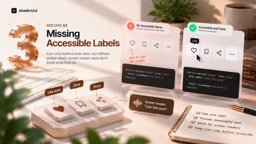
Visual interfaces rely heavily on icons and layout to communicate meaning. Screen readers can’t see either. They read the accessible name of each element, and if there isn’t one, users hear something useless.
This usually happened with small interactive components:
- Icon buttons
- Search inputs
- Dropdown triggers
- Command menus
- Form controls
The problem was not the design. The problem was missing context. shadcn/ui provides accessible component patterns, but developers still need to provide meaningful labels and descriptions when creating custom interactions.
The Common Mistake: Icon-Only Buttons Without Labels
A very common example:
<Button> <Search/> </Button>
For a visual user, this is obvious. They see the search icon. But a screen reader does not see the icon.
It reads something like:
**”Button”**
That creates a problem. A user now has no idea what this button does.
Better Solution
Add an accessible name:
<Button aria-label=”Search”>
<Search />
</Button>
Now the screen reader announces:
**”Search button”**
The visual design remains unchanged.
When To Use aria-label
Use aria-label when:
- There is no visible text.
- The icon itself represents the action.
- The meaning is obvious visually but not programmatically.
Examples:
Search button
<Button aria-label=”Search”>
<Search />
</Button>
Close button
Bad:
<Button>
<X />
</Button>
Better:
<Button aria-label=”Close dialog”>
<X />
</Button>
Settings icon
<Button aria-label=”Open settings”>
<Settings />
</Button>
Input Fields Without Labels
Another common issue:
<Input placeholder=”Email address” />
This looks acceptable. But placeholders are not labels.
Why Placeholder Text Is Not Enough
The problem:
- Before typing: Email address
- After typing: john@example.com
The user may forget:
- What information belongs here?
- Is this username?
- Email?
- Work email?
Screen readers also need a persistent label.
Bad Example
<div>
<Input placeholder=”Password” />
</div>
Better Example
<div>
<Label htmlFor=”password”>
Password
</Label>
<Input
id=”password”
type=”password”
/>
</div>
Now:
- Visual users see the label.
- Screen readers understand the relationship.
Using aria-labelledby
Sometimes the label already exists somewhere else.
Example:
<h2 id=”dialog-title”>
Delete Account
</h2>
<Dialog>
<DialogContent aria-labelledby=”dialog-title”>
…
</DialogContent>
</Dialog>
The dialog now receives context from the heading.
Components Commonly Affected
During audits, these components frequently had missing labels:
Search Components
Example:
- Should communicate: Search commands
- Command palette: <CommandInput />
Dropdown Menus
A dropdown trigger needs a clear purpose.
Bad:
<Button>
<MoreHorizontal />
</Button>
Better:
<Button aria-label=”More actions”>
<MoreHorizontal />
</Button>
Dialogs
Dialogs should announce:
- Title
- Purpose
- Description
Example:
<DialogContent>
<DialogHeader>
<DialogTitle>
Delete project
</DialogTitle>
<DialogDescription>
This action cannot be undone.
</DialogDescription>
</DialogHeader>
</DialogContent>
Forms
Every important field should have:
- Label
- Description if needed
- Error message association
How Screen Readers Understand Components
Screen readers depend on the accessibility tree.
They need:
Role
+
Name
+
State
+
Relationship
Example:
A button should expose:
Role:
Button
Name:
Save changes
State:
Disabled
Without these properties, the interface becomes incomplete.
Mistake 4: Breaking Keyboard Navigation
One of the biggest differences between a good component and a great component:
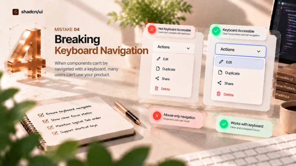
A great component works without a mouse. During testing, I found many custom components that worked perfectly with clicks but completely failed with keyboards.
The Common Mistake: Using div Instead of Button
Developers often create custom interactions like this:
<div onclick=”openMenu”>
Open Menu
</div>
- Visually:- Looks like a button.
- Technically:- It is just a meaningless container.
Why This Breaks Accessibility
A <div> does not automatically support:
- Keyboard focus
- Enter key activation
- Space key activation
- Button semantics
A keyboard user cannot properly interact with it.
Better Solution
Use semantic HTML:
<button>
Open Menu
</button>
The browser automatically provides:
- Focus support
- Keyboard interaction
- Correct accessibility role
Semantic HTML Is Your First Accessibility Tool
Before adding ARIA:
Ask:
**”Can native HTML solve this?”**
Usually, the answer is yes.
Examples:
Instead of:
<div role=”button”>
Use:
<button>
Instead of:
<div role=”link”>
Use:
<a href=”/”>
Keyboard Testing Checklist
Every interactive component should support:
Tab
Move between elements.
Tab → Next item
Shift + Tab → Previous item
- Enter: (Activate)Buttons, Links, Menu items
- Space: (Activate)Buttons, Checkboxes, Toggles
- Escape: (Close)Dialogs, Dropdowns, Popovers
- Arrow Keys: (Navigate)Tabs, Select menus, Command menus
shadcn/ui Components To Test Carefully
Dialog: Focus should move into the dialog when it opens, stay trapped inside while open, close with Escape, and return to the trigger on close. Custom close handlers or conditional rendering tricks sometimes break focus return.
Select: Arrow keys should move between options, Enter should select, and typing a letter should jump to matching options.
Dropdown Menu: The trigger must be a real button (watch for the asChild trap), items should be reachable with arrow keys, and Escape should close the menu and return focus.
Tabs: Tab should move into the tab list, and arrow keys should move between tabs. Teams sometimes wrap TabsTrigger in custom links, which breaks this pattern.
Accordion: Each trigger should be focusable and toggle with Enter or Space. Watch for custom headers that place clickable content outside the trigger.
Command: Arrow keys should move through results, Enter should select, and the input should keep focus while navigating the list.
Mistake 5: Ignoring Reduced Motion Preferences
Modern React interfaces move a lot: Framer Motion entrance animations, scroll-triggered reveals, parallax, hover effects that scale and shift, page transitions, and animated dialogs and drawers.
Motion can make interfaces feel polished. For some users, it makes them physically unusable.
That is great for:
- Engagement
- Product personality
- Visual hierarchy
But motion should always be controlled.
During audits, I found many websites using:
- Framer Motion transitions
- Scroll animations
- Parallax effects
- Large page transitions
without considering users who prefer reduced motion.
Why Motion Accessibility Matters
Some users experience:
- Motion sickness
- Dizziness
- Difficulty concentrating
when interfaces contain excessive movement. A beautiful animation for one user can become a barrier for another.
Respect prefers-reduced-motion
CSS provides a built-in media query:
@media (prefers-reduced-motion: reduce) {
* {
animation-duration: 0.01ms;
transition-duration: 0.01ms;
}
}
This allows users to tell the browser:
“Reduce unnecessary movement.”
Framer Motion Example
Many React applications use Framer Motion.
Instead of:
<motion.div
animate={{
y: 100
}}
>
Content
</motion.div>
Use:
const shouldReduceMotion = useReducedMotion();
<motion.div
animate={
shouldReduceMotion
? {}
: { y: 100 }
}
>
Content
</motion.div>
Practical Motion Improvements
You do not need to remove all animations.
Instead:
Reduce Distance
- Bad: Element flies 800px across screen
- Better: Element moves 20px
Reduce Duration
Bad: 2 second transition
Better: 200-300ms
Remove Decorative Motion
Keep animation for:
- Feedback
- State changes
- Understanding interactions
Remove:
- Constant floating effects
- Endless background movement
- Distracting loops
A proper accessibility audit cannot depend only on automated tools. Tools are useful, but they cannot understand every real user experience.
Manual testing
Keyboard-only navigation. Mouse unplugged (or at least out of reach). Every interactive element needed to be reachable, operable and escapable with the keyboard alone.
Focus testing. Tabbing through each component to confirm the focus indicator was always visible, focus order matched the visual order, focus moved into overlays when they opened and returned to the trigger when they closed.
Screen reader testing. VoiceOver on macOS and iOS, and NVDA on Windows. For each control I listened for a clear name, the correct role and accurate states (expanded, selected, checked, invalid).
Visual stress tests. Zooming to 200%, enabling forced colors (Windows High Contrast), switching to dark mode, and turning on reduced motion at the OS level.
Automated Testing Tools
Useful tools:
Lighthouse gives a fast accessibility score in Chrome DevTools and is useful for catching obvious issues across pages.
axe DevTools was my primary automated checker. It’s precise, has low false-positive rates, and explains how to fix each issue. You can also run it in CI with @axe-core/playwright or jest-axe.
WAVE is excellent for visualizing issues directly on the page, including structure, headings, labels and contrast.
Why Automated Testing Is Not Enough
Automated tools are great at detecting missing labels, contrast failures and invalid ARIA. They can’t tell you whether a label makes sense, whether focus order is logical, whether a dialog returns focus correctly, or whether an animation makes someone dizzy.
Many of the most serious issues I found, including broken focus return, missing arrow-key support and confusing announcements, passed automated scans completely.
Accessibility requires both automated checks and human testing. Automated tools find the easy problems quickly; manual testing finds the problems that actually block users.
Accessibility Checklist Before Shipping Any Component
Keyboard
- Works completely without a mouse
- Visible focus state on every interactive element
- Logical focus order that matches the visual layout
- Proper keyboard interactions (Enter, Space, Escape, arrow keys where expected)
- Focus returns to the trigger when overlays close
Screen reader
- Buttons have meaningful names, including icon-only buttons
- Every form field has a real, associated label
- Dialogs have a title and announce correctly
- States (expanded, selected, checked, invalid) are announced
- Error messages are connected with aria-describedby
Visual
- Text meets 4.5:1 contrast (3:1 for large text)
- Input borders, icons and focus rings meet 3:1
- Both light and dark mode tested
- Hover, focus, active, disabled and error states are clearly distinguishable
- No information communicated by color alone
Motion
- Respects prefers-reduced-motion
- No large movement, parallax or zoom for reduced-motion users
- Important feedback remains visible without animation
- Animations are short and comfortable
Final Thoughts
For larger screens and layout references, Shadcn Pages can help keep the broader interface consistent while applying the same accessibility standards.
After more than a thousand components, my biggest takeaway is simple:
**shadcn/ui gives developers an accessible foundation, but accessibility is maintained through every design and development decision.**
The library does its part. Radix handles focus traps, ARIA and keyboard patterns that would take weeks to build correctly. But because you own the code, every className change, theme tweak and custom wrapper is a chance to keep that foundation intact or quietly break it.
A few principles worth holding on to:
Don’t remove accessibility features for aesthetics. If a focus ring or label doesn’t fit the design, restyle it. Don’t delete it.
Test components before adding them to your design system. One inaccessible component in a shared library becomes hundreds of inaccessible instances across your product.
Accessible UI and beautiful UI can exist together. Branded focus rings, readable muted colors, thoughtful labels and calm motion aren’t compromises. They’re signs of a well-crafted interface.